Jon Brazer Enterprises is committed to bringing you the highest quality products. To this end, we have uploaded the PDF to the second printing of the Book of the River Nations: Complete Player’s Reference for Kingdom Building to both DriveThruRPG/RPGNow and Paizo.com. To receive your PDF copy, goto the downloads page of the respective website and click on the Book of the River Nations link. This printing incorporates the errata and rules clarifications that had previously been available online.
While the second printing had come out earlier this summer, I had only recently realized that I had not previously uploaded it to web. If you are wondering if your print book is a first printing or second printing, first printings are staple bound while second printings are perfect bound. We apologize for not uploading the book sooner and hope that you enjoy the material.
And as always, we hope that the book is enhancing your world and your game.
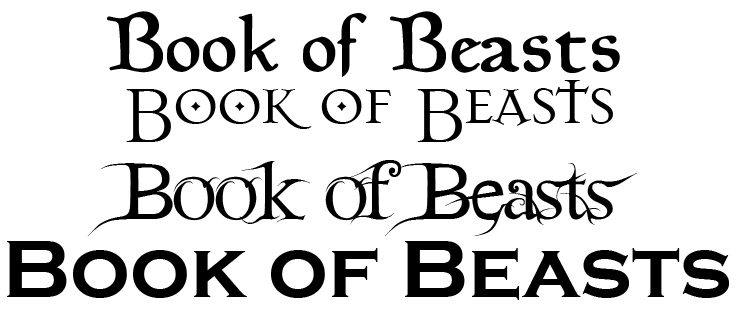
Last night I was working on the cover to the next Book of Beasts. Placing the logos is a lot more time consuming than you’d think. “Does it look good here or should I move it over 2 pixels?” is a common question. Yes, being that nitpicky really is that important.
So I came to the title. I put it in place and made sure it filled the space. Done. I sat back and thought about it and I didn’t feel the font was perfect. So I changed it. About a dozen different font tests later, I still wasn’t satisfied. I narrowed them down to the above 4 choices (click on the image to see a larger version of it). To me, each says something different. The top choice says “Disney movie” to me. Its a beautiful font, but I don’t want someone looking at the Book of Beasts and thinking Beauty and the Beast.
The font below that one to me says “Gothic Horror.” It makes me think of Dracula and all the classic horror stories we geeks grew up on. That’s good, but I’m not sure if that is what I am looking for with this one. I will admit, since I used it in Book of Beasts: Wandering Monsters 1 as the logo, this font might be chosen. Branding is important.
The next to the bottom font is cool and all but … for some reason I think of Pan’s Labyrinth. While that is a good thing in my opinion, I’d prefer it more for something like if I was doing what Paizo calls the First World or White Wolf calls Arcadia or Jim Butcher calls the Nevernever. Basically, Faerie. That is definitely not what I am doing with this. But I still like the font.
The bottom font is more of what I consider to be a basic font. It presents the title in big attention grabbing letters. As a small publisher, grabbing attention is important. However, the font itself does little to promote the fact that this is a fantasy book. I could see this font being used in science fiction or modern or super heroes. Definitely super heroes.
So what do you think. Is there one you like more than the others. Is there a font you like that I didn’t use. Check out dafont.com for more awesome fonts.
We’re looking at getting a tentative convention schedule for the next year assembled, but a lot of cons have poorly maintained (or non-existant) websites. Many others we find their website by accident instead of a simple Google search. So we’re coming to you. What local gaming cons do you goto that we should be at. Realistically, we can only go anywhere inside the area of Columbus OH, Rochester, NY, Boston, MA, and Norfolk, VA. We’re really only looking at smaller gaming cons (as small as 50 to as large as 5,000-10,000 attendees). Anything larger (or any size non-gaming focused convention) and a small company like ours tends to get lost in the sea of vendors. We’re currently looking for either Pathfinder-focused cons or a general gaming con where Pathfinder is one of the games played. I’m more than happy to run some games.
So we’re asking you. What is your favorite gaming con? Tell us! We love small cons of 50-100 attendees. They’re really small and personal and we get to know all the gamers there. Tell us about your local con today.
So GenCon is over for the year. The news coming out of the great gamer con is exciting as it always is. Most exciting for us is Paizo’s Pathfinder announcements. Incase you had not heard, the word is that Paizo will be releasing Ultimate Equipment as their GenCon 2012 release and the AP after the Pirate themed one is going to be about artifact-hunting and more Runelord stuff. All of which sounds like fun to us but we’re even more thrilled that our plans for 2012 are completely different.
We were really worried that Paizo was going to do something similar enough that it would leave us largely ignored. To date, we have 4 covers commissioned and turned in, manuscripts for large sections of those books turned in (and one is nearly finished) and deals made for several more tie in surprises. All that would be for not if the main company was doing something in a similar vein.
I’m not ready to say anything yet. We’re about 2ish months away from making any formal announcement but subscribers to our newsletter will be getting exclusive previews and first looks each month. Sign up today to stay in the know.
Are you going to GenCon? No? Neither are we. We at Jon Brazer Enterprises want to give you the next best thing, namely getting your favorite PDFs at 20% off. From now through Aug 7th, you can grab ALL of our PDFs (that are over 50 cents) for 20% off. That’s right! All of them. Even our newest release: Book of the River Nations: Complete Player’s Reference to Kingdom Building is on sale for 20% off.
Grab them now at DriveThruRPG/RPGNow! This sale ends Aug 7th. Get yours today!