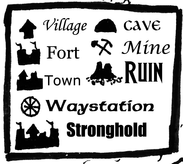
This past weekend, the map arrived for the first Shadowsfall campaign that we are hard at on work. I would love to show you the full map, but we are still putting names on everything. There is one part of the map that I am able to show you right now and it is the legend. In the picture above, you can see all the symbols of places in the area. It shows everything from villages and towns all the way to the stronghold at the center of the campaign: Blackbat.
There is another reason why I am showing you the legend. It is because I would like your help deciding on the font we should be using for the map. It is difficult because we want it both stylized and easy to read. If it is not easy to read, then it fails at its main purpose as a map. However, if we go with something that is obviously a modern font it will pull your mind out of the immersion of the world. So we are looking for the right balance.
Some of the fonts there are modern fonts simply to have a baseline. Others are more stylized. Take Ruin for example; that font is the same font that we used for the Shadowsfall logo.
Tell us which font is your favorite in the comments below.
The Not Going to PaizoCon 2019 Sale! is going on now. Grab our PDFs at 60% off their regular price at the JBE Shop.

I like Cave, it’s reminiscent of brush hand lettering like illuminated texts by cloistered clerics.
I’m partial to Cave as it’s reminiscent of hand-lettered script in illuminated texts by cloistered clerics.